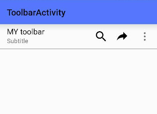
Android-L introduced a new widget called Toolbar . The new Toolbar contains the following elements: A navigation button . This may be an Up arrow, navigation menu toggle, close, collapse, done or another glyph of the app's choosing. This button should always be used to access other navigational destinations within the container of the Toolbar and its signified content or otherwise leave the current context signified by the Toolbar. A branded logo image . This may extend to the height of the bar and can be arbitrarily wide. A title and subtitle . The title should be a signpost for the Toolbar's current position in the navigation hierarchy and the content contained there. The subtitle, if present should indicate any extended information about the current content. If an app uses a logo image it should strongly consider omitting a title and subtitle. One or more custom views . The application may add arbitrary child views to the Toolbar. They will appear at this position wit...