Posts

Android #gist: A SectionedGridRecyclerViewAdapter

Image
It is a SectionedGridRecyclerViewAdapter . It is the porting of the SimpleSectionedListAdapter[1] provided by Google with the #io code. It can be used to realize a simple sectioned grid without changing your adapter. It works with a RecyclerView with a GridLayoutManager. Here the code : [1]: Google Io14

Android-5: Card and images with rounded corners in Android 4

Card and images with rounded corners in Android 4 As you know the CardView in support library has a different behaviour for API=21 and API &lt 21. If you would like to have an image (full or partial) inside your cardView with Rounded corners it is by default only in Android 5. This gist can be useful to achieve the same aspect also in Android V4 (and as always it can be improved) Here the link . The trick is to elaborate the image and obtain an image with rounded corners (I am using the snippet published by +Romain Guy) Pay attention: you have to use cardView.setPreventCornerOverlap(false) ; to avoid the internal padding in api&lt21.

Android-5 tip about the Toolbar and the Style

Toolbar style and theme. With the new Toolbar you can apply a style and a theme . They are different! The style is local to the Toolbar view, for example the background color. The app:theme is instead global to all ui elements inflated in the Toolbar, for example the color of the title and icons.

Android-L #gist4: a SimpleSectionedRecyclerView

Image
It is a SimpleSectionedRecyclerViewAdapter . It is the porting of the SimpleSectionedListAdapter[1] provided by Google with the #io code. It can be used to realize a simple sectioned list without changing your adapter. It works with a RecyclerView with a LinearLayoutManager and also work with the TwoWayView with the ListLayoutManager. Here the code : ps: the RecyclerView pattern is new... then this code can be improved (I am sure). [1]: Google Io14

Android-L gist#3 : Recycler View: Item Animations

Image
Here you can find a little collection of ItemAnimators for the RecyclerView . SlideInOutLeftItemAnimator : which applies a slide in/out from/to the left animation SlideInOutRightItemAnimator : which applies a slide in/out from/to the right animation SlideInOutTopItemAnimator : which applies a slide in/out from/to the top animation Github repo: https://github.com/gabrielemariotti/RecyclerViewItemAnimators

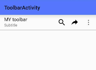
Android-L gist#2: A little gist for the new Toolbar

Image
Android-L introduced a new widget called Toolbar . The new Toolbar contains the following elements: A navigation button . This may be an Up arrow, navigation menu toggle, close, collapse, done or another glyph of the app's choosing. This button should always be used to access other navigational destinations within the container of the Toolbar and its signified content or otherwise leave the current context signified by the Toolbar. A branded logo image . This may extend to the height of the bar and can be arbitrarily wide. A title and subtitle . The title should be a signpost for the Toolbar's current position in the navigation hierarchy and the content contained there. The subtitle, if present should indicate any extended information about the current content. If an app uses a logo image it should strongly consider omitting a title and subtitle. One or more custom views . The application may add arbitrary child views to the Toolbar. They will appear at this position wit...

Wear gist#4: How to use a simple a GridViewPager with a FragmentGridPagerAdapter

Image
It is very simple to use the FragmentGridPagerAdapter in your Android Wear App. You can build a new CardFragment with the default layout including title, text and icon using the method: CardFragment.create(page.mTitle, page.mText, page.mIconId) Also you can provide a background overriding the getBackground(int row, int col) method in your adapter. Very useful the class ImageReference which provides a reference to an image Here a small gist